Branding
Vision Group Rebrand (2025)
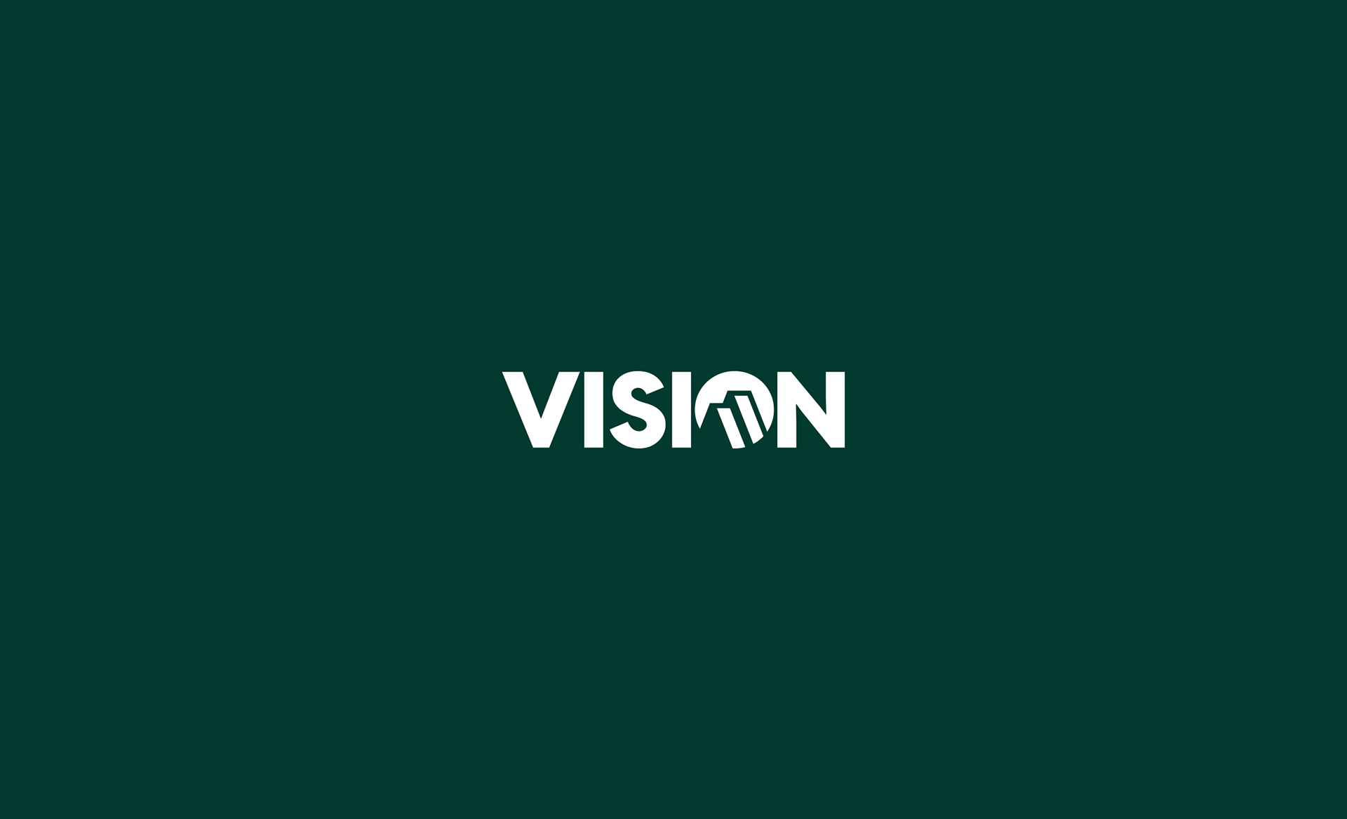
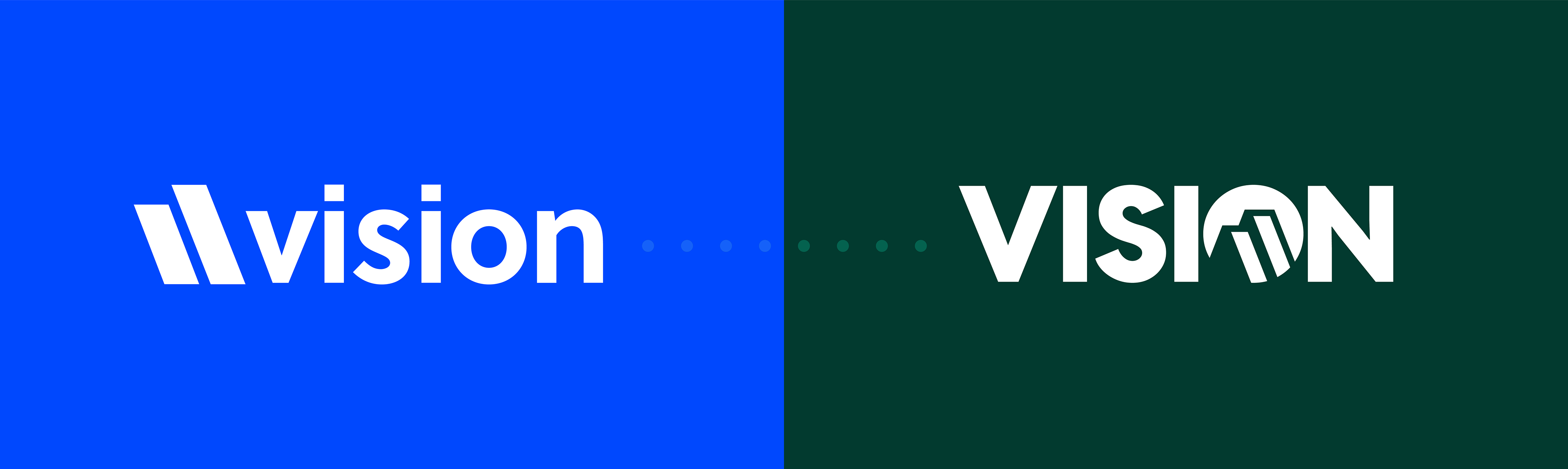
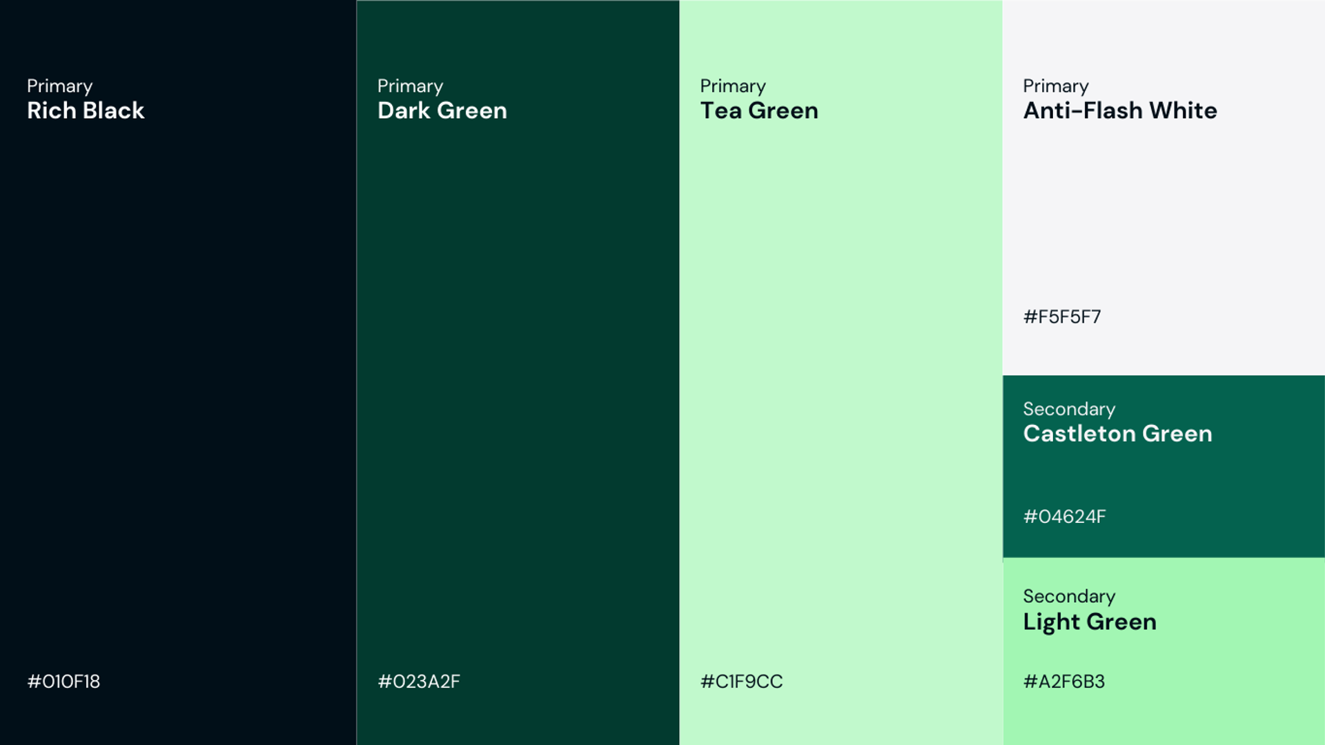
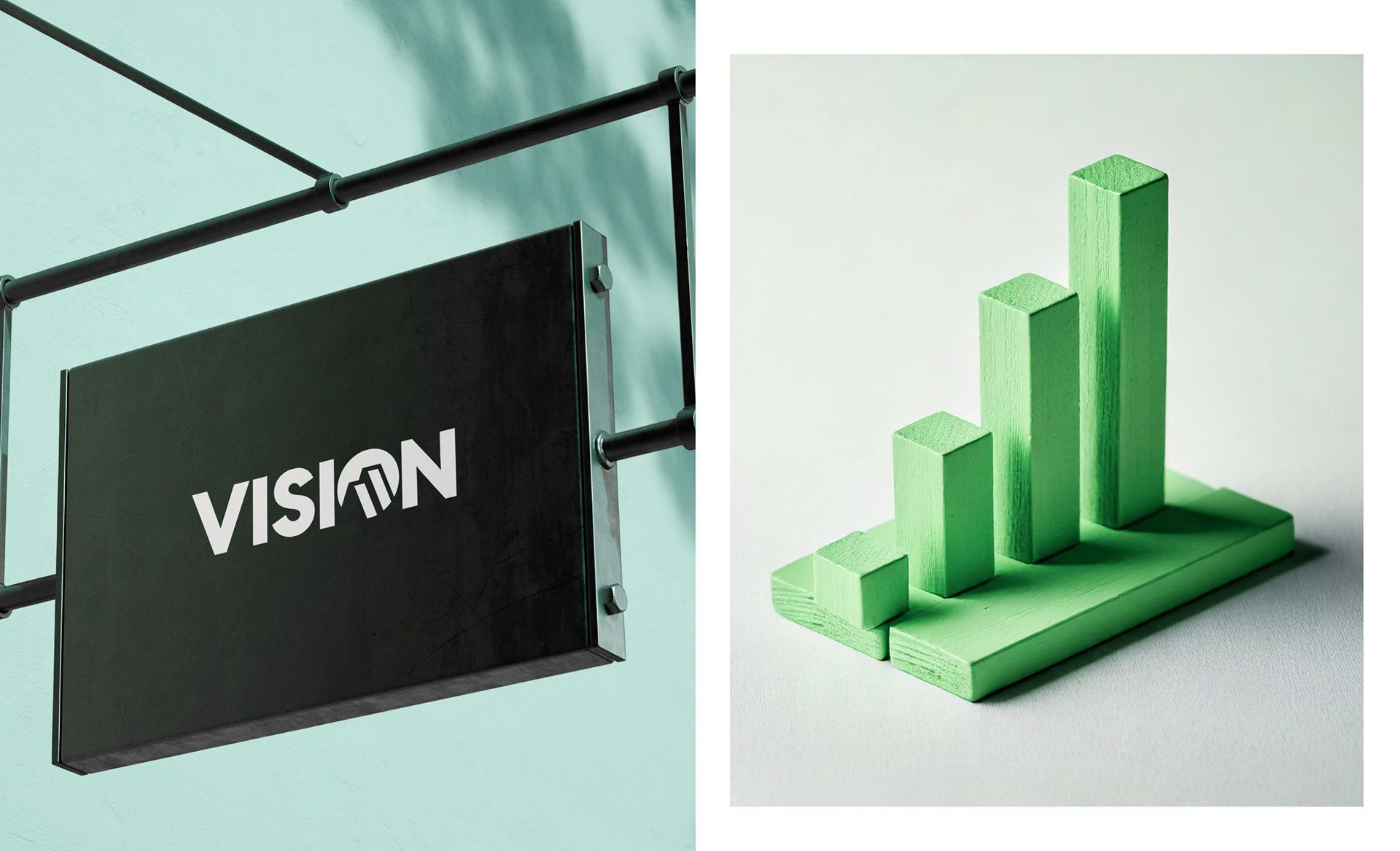
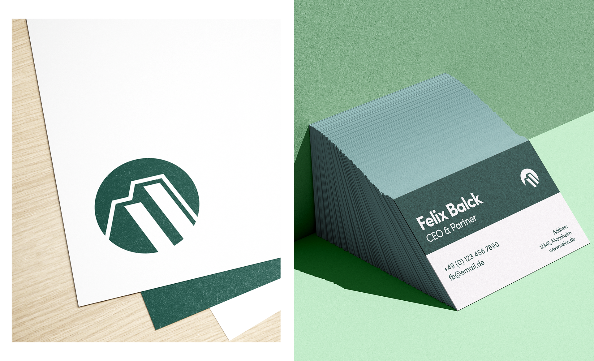
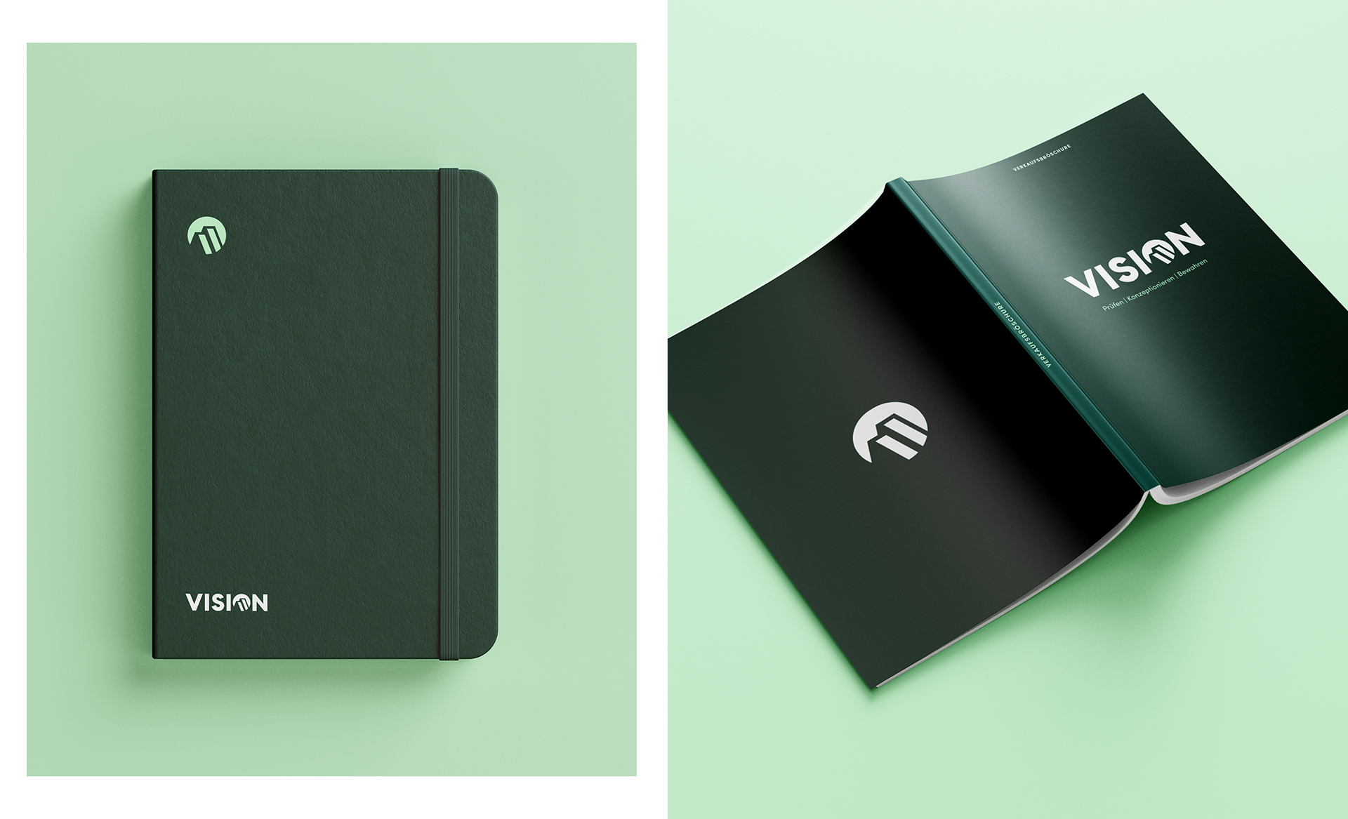
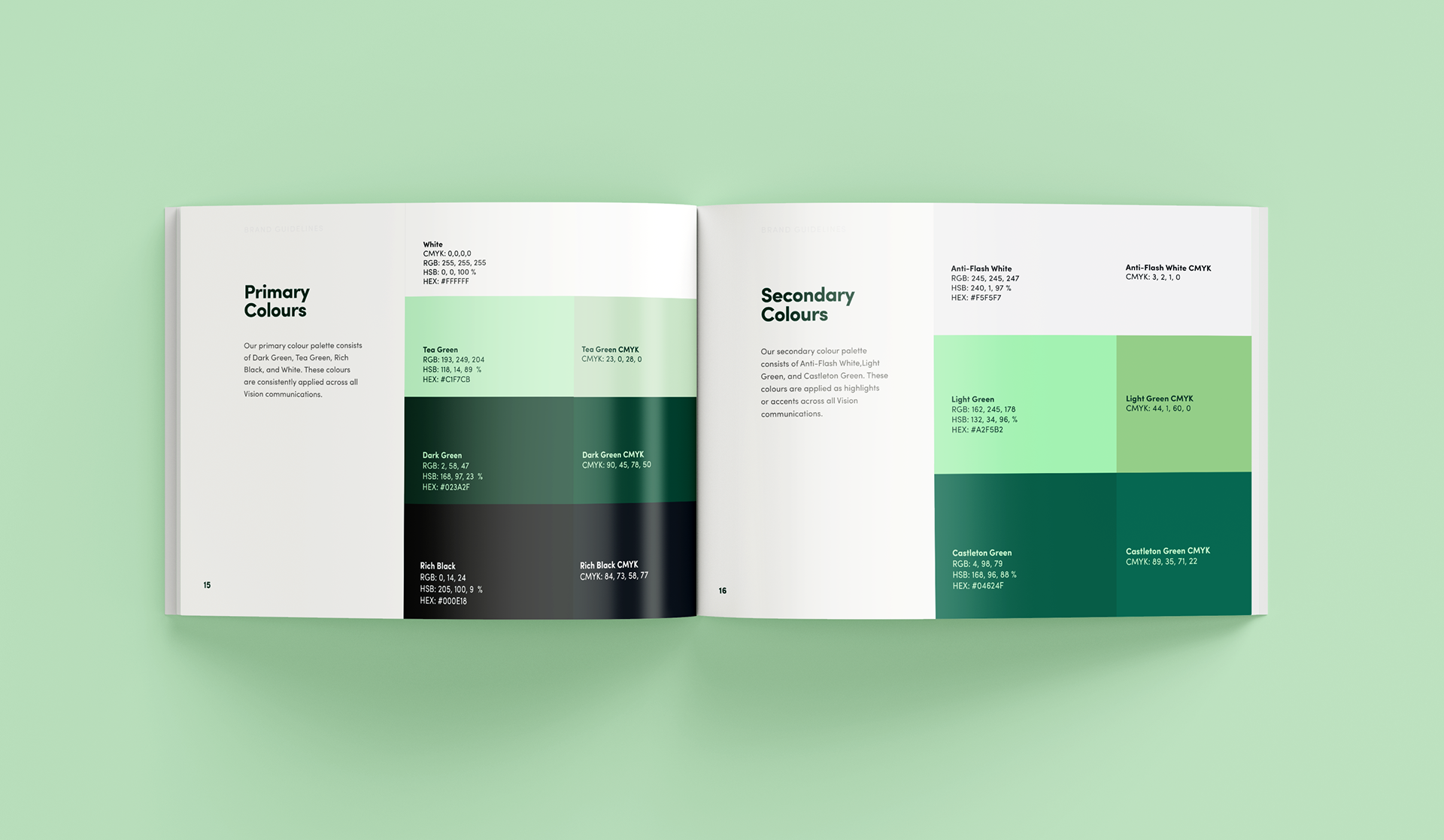
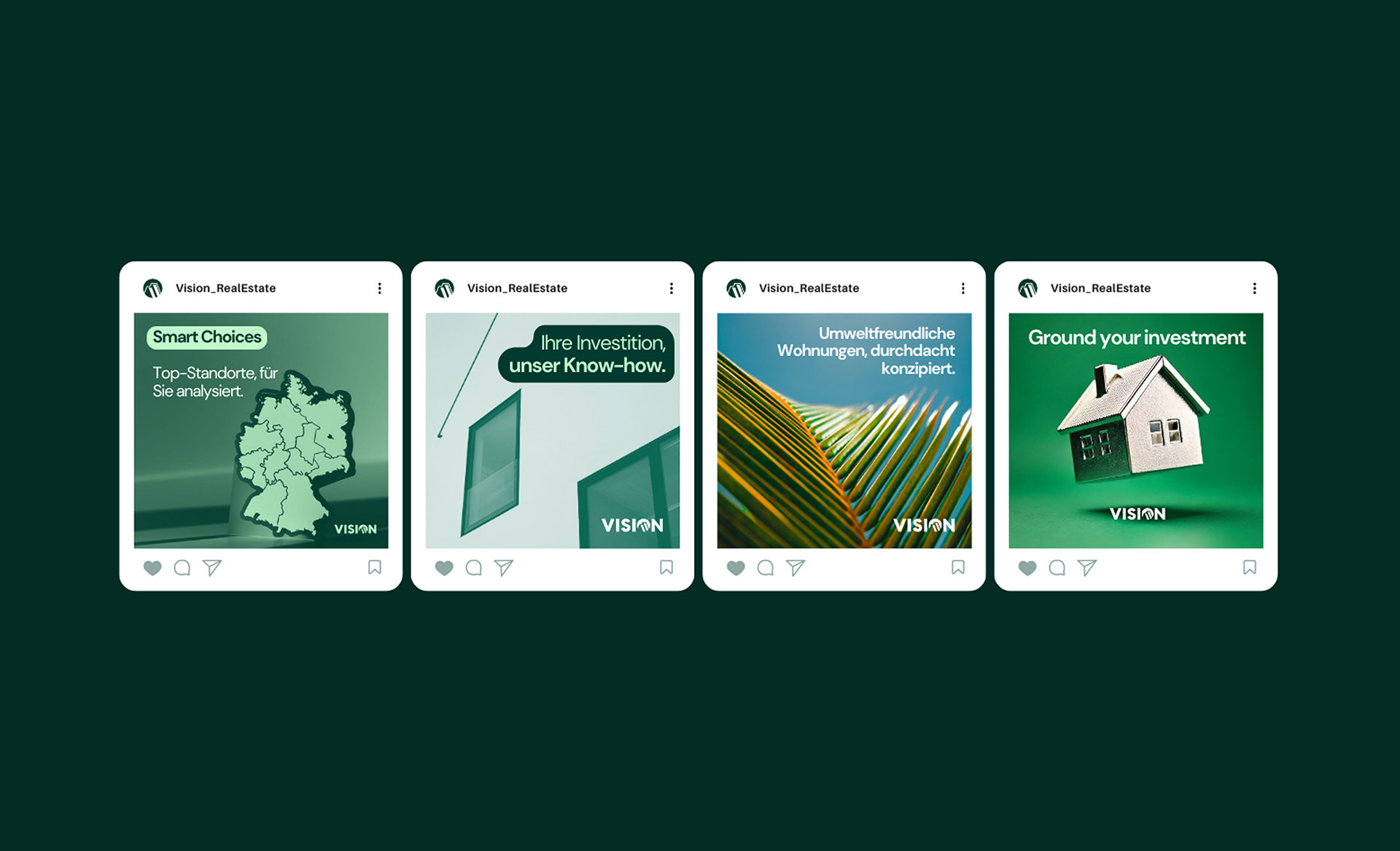
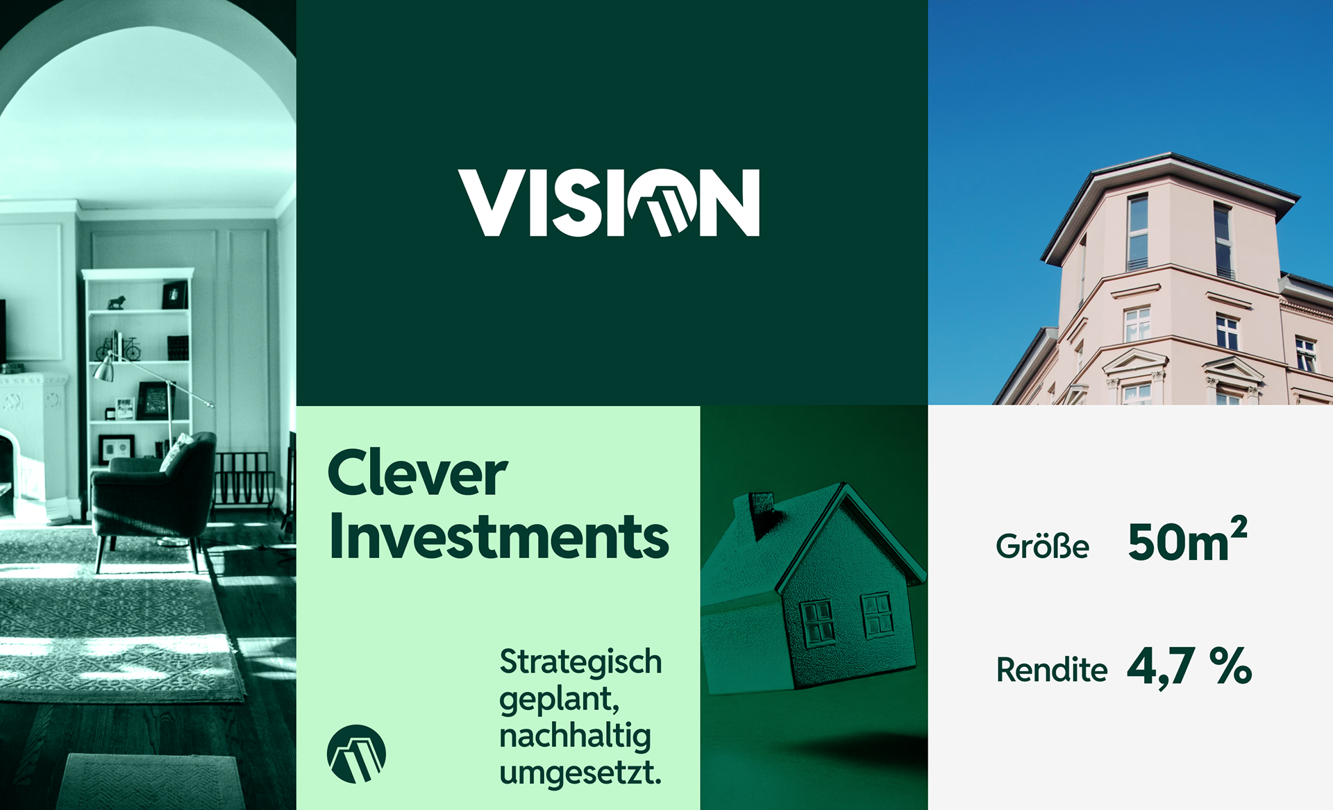
Vision Group transitioned to a B2C-focused model, offering concept-driven real estate solutions tailored to individual investors. This shift necessitated a comprehensive rebrand to reflect their forward-thinking mission and modern approach. The new identity balances sophistication and approachability, featuring a sleek logo that integrates the original angled bars into a stylized building roof within the ‘O’ of Vision, adding depth through subtle shadows. Using Reddit Sans in all caps, the typography reinforces a clean, modern look, reflecting transparency and innovation. A refined color palette of dark and light greens evokes nature, balance, and sustainability, while white enhances clarity and freshness.
Sector
Real Estate
Role
Creative Direction
Work
Visual Identity