Brand Identity
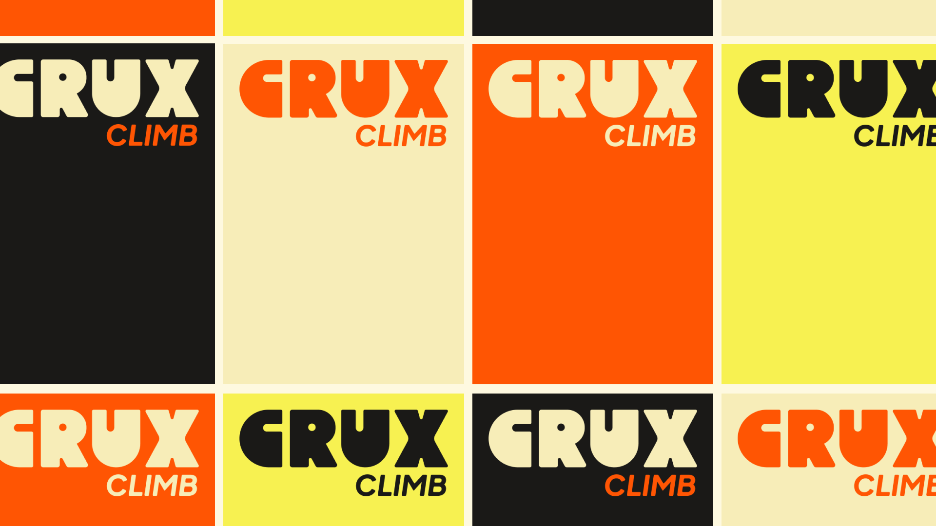
Crux Climb
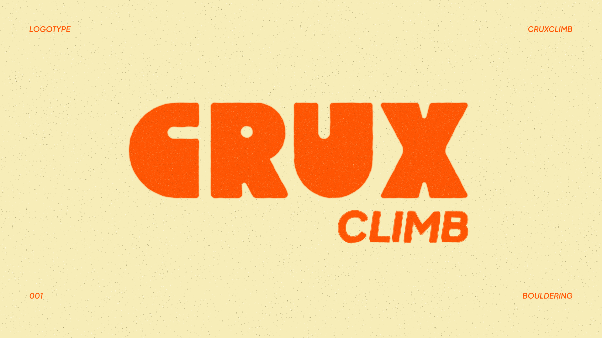
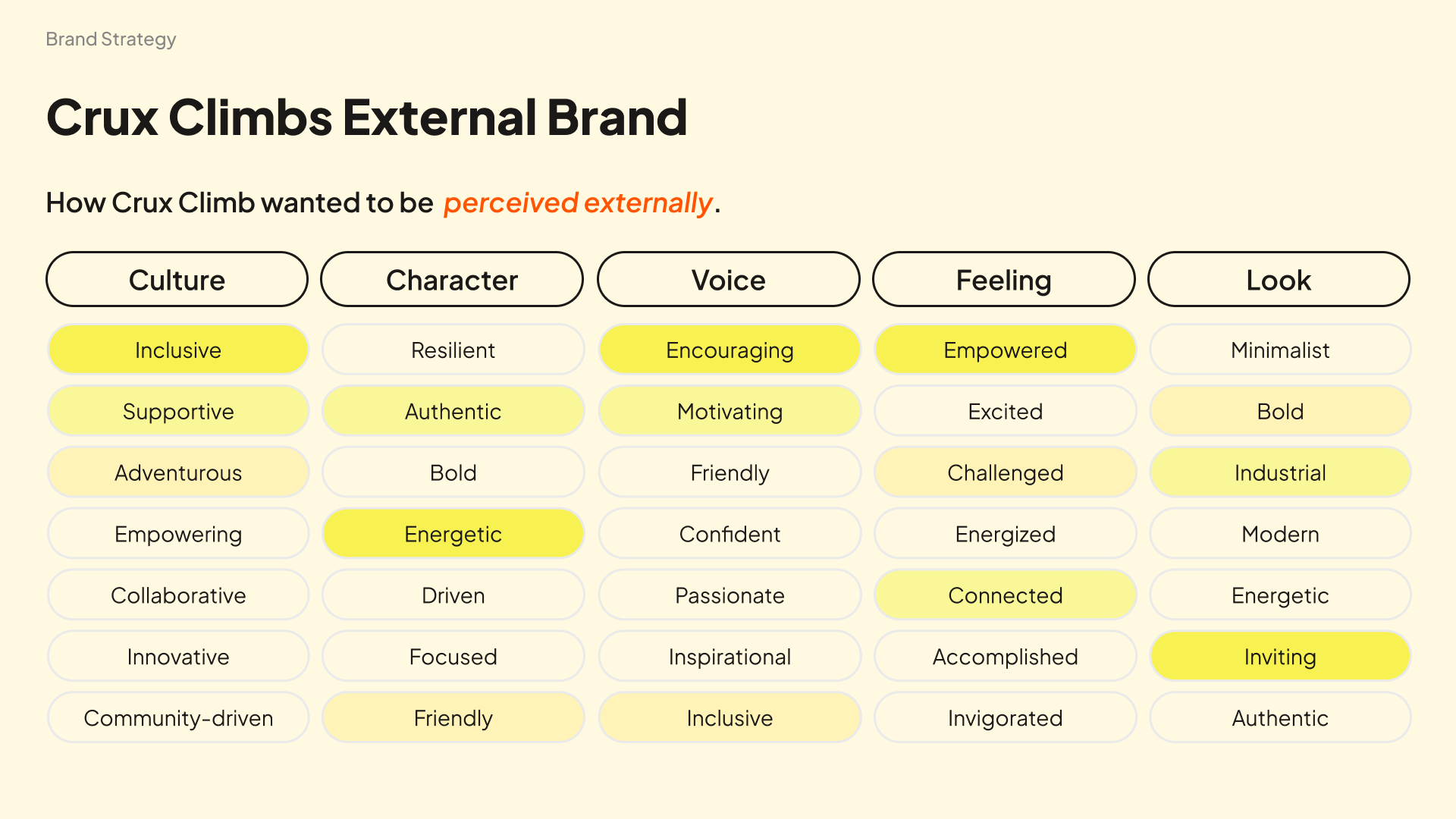
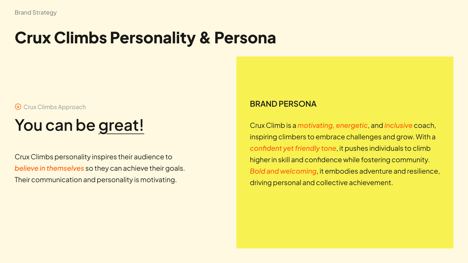
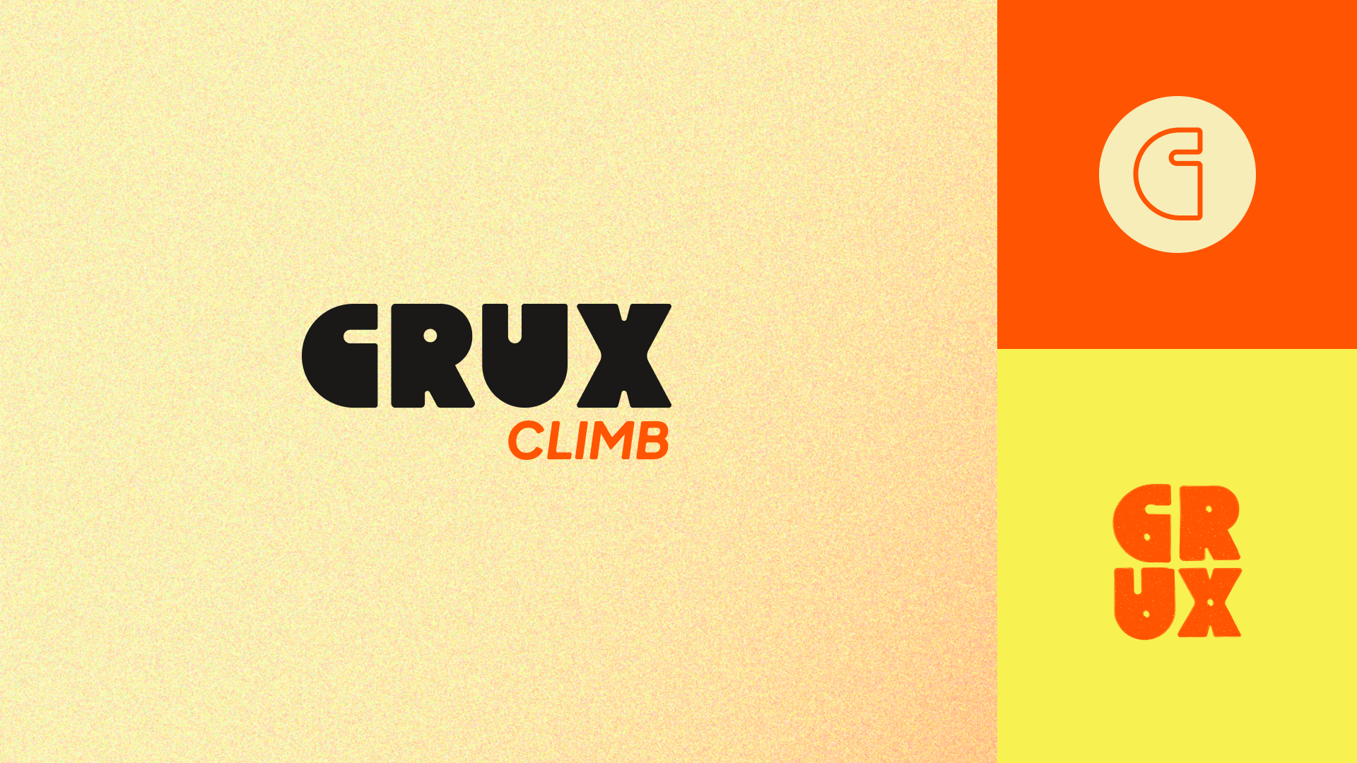
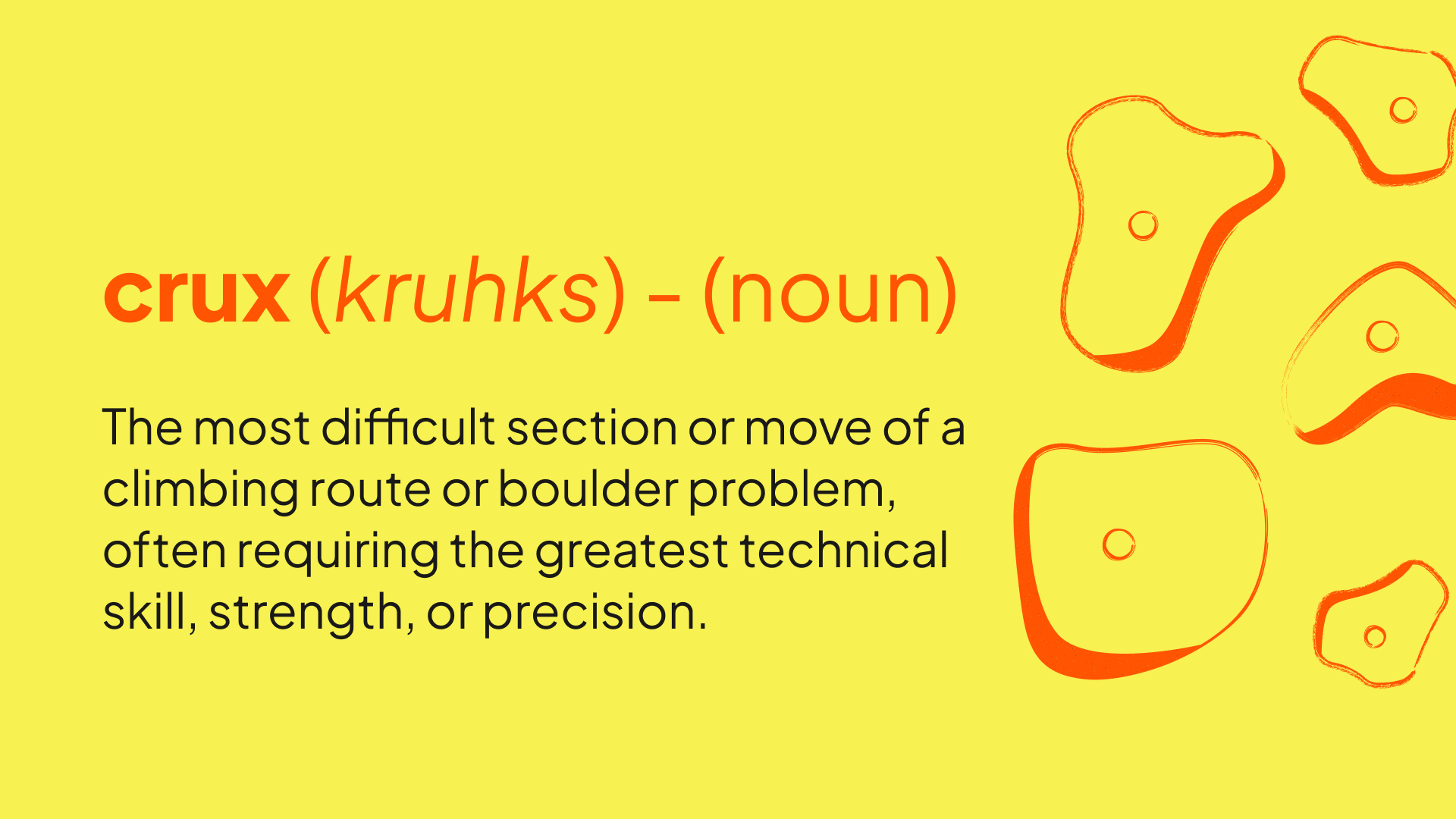
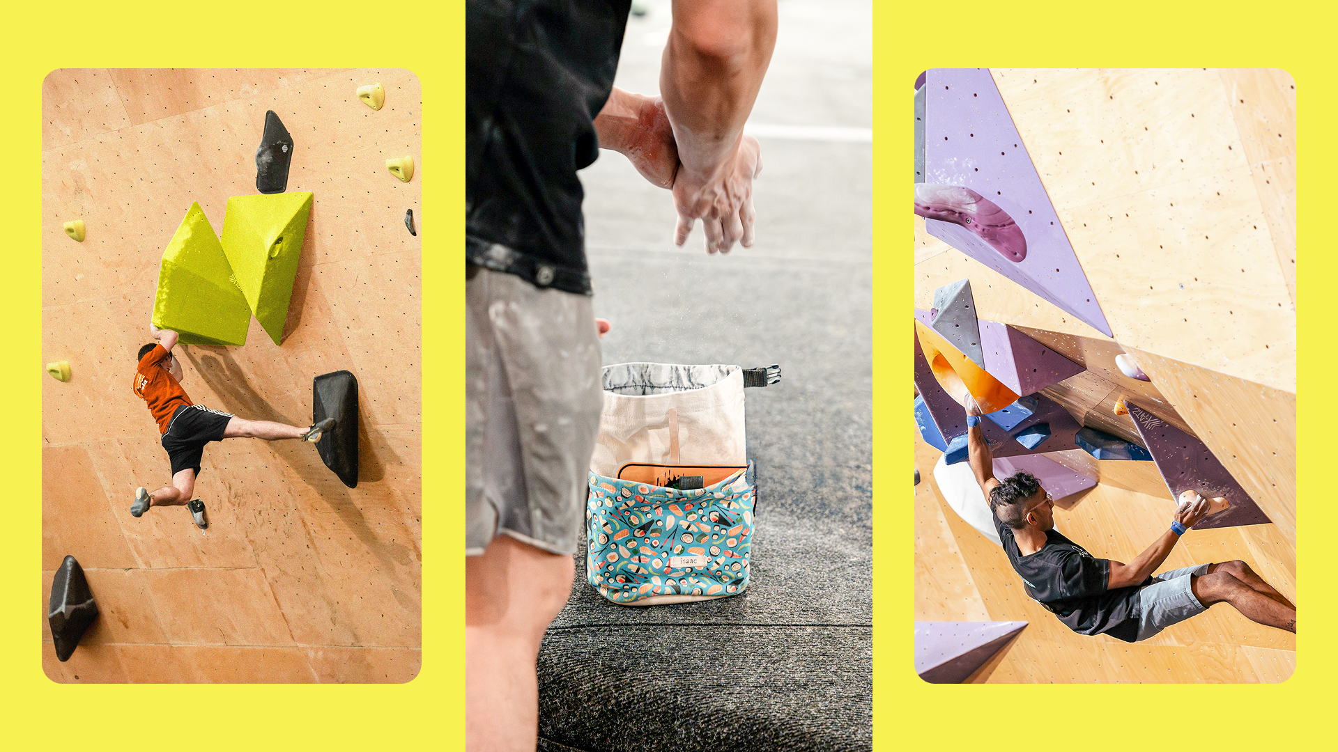
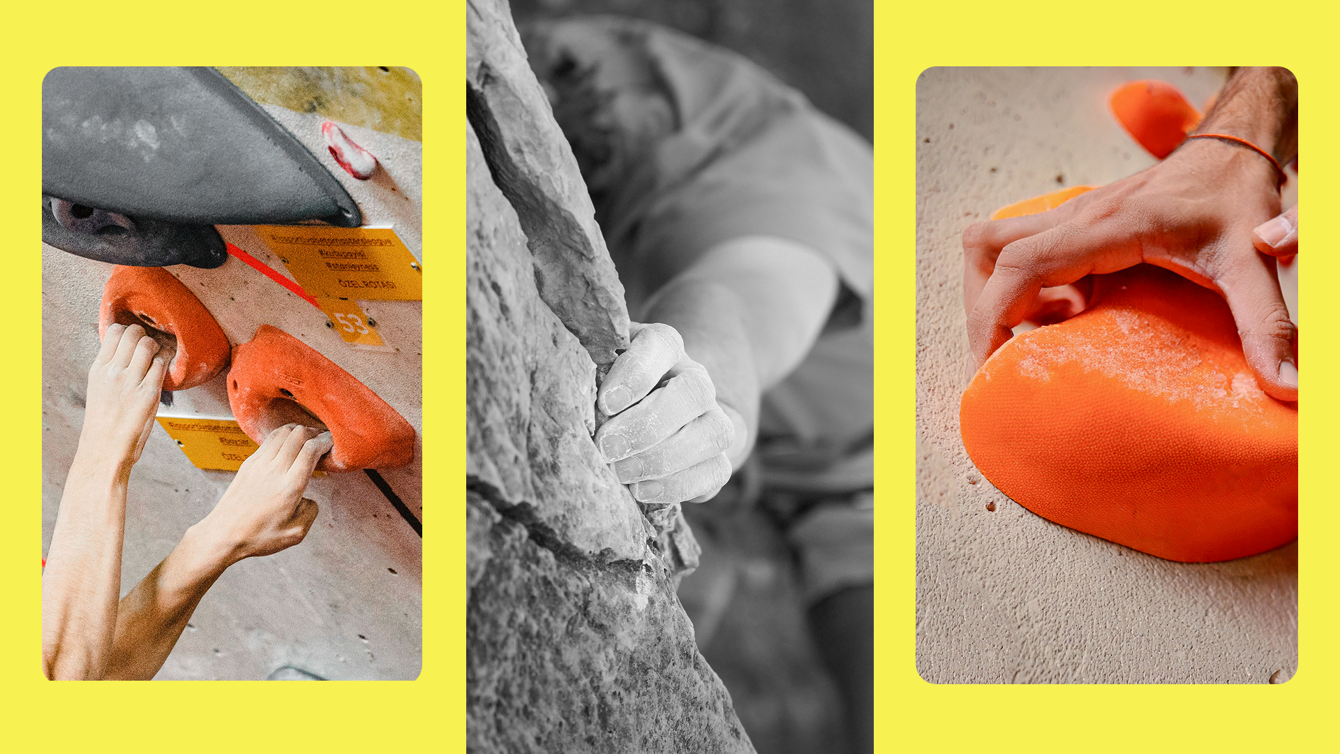
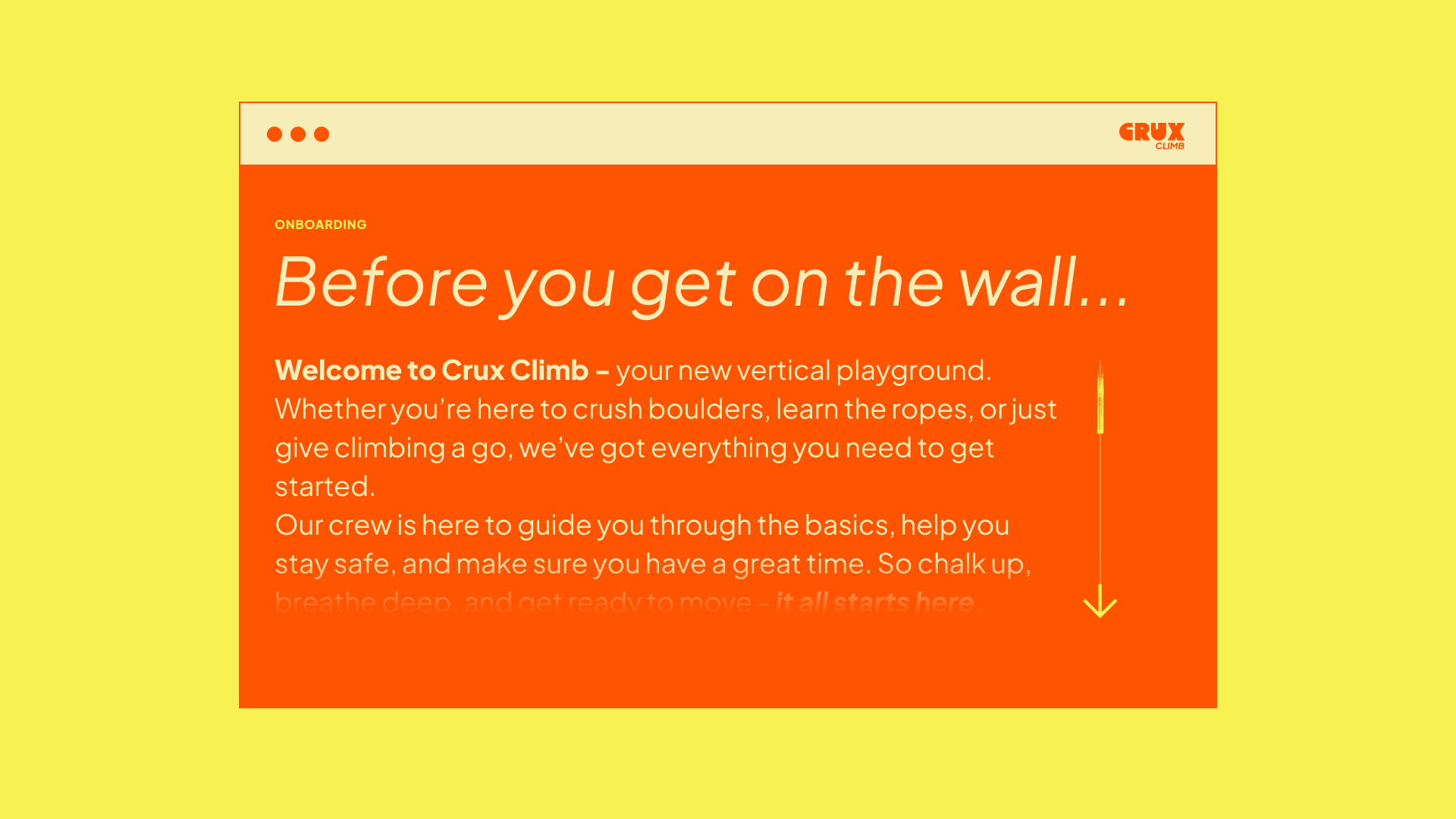
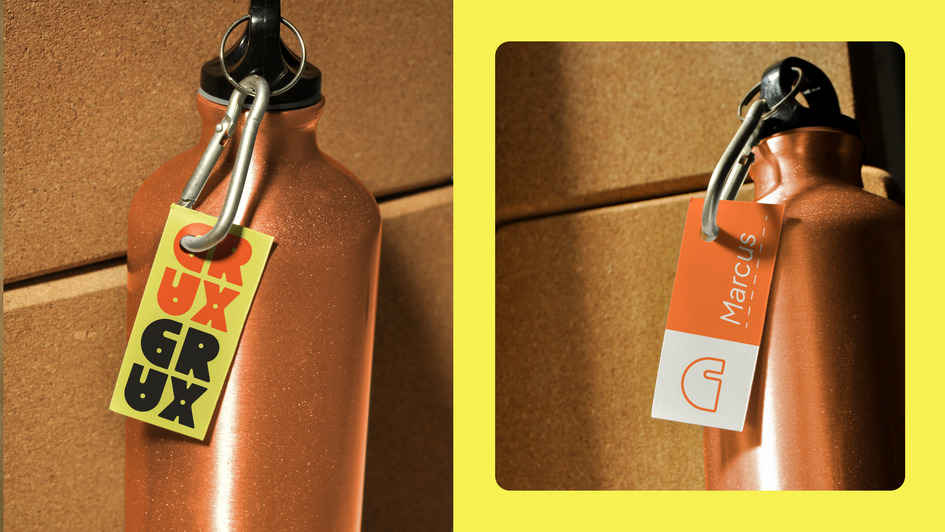
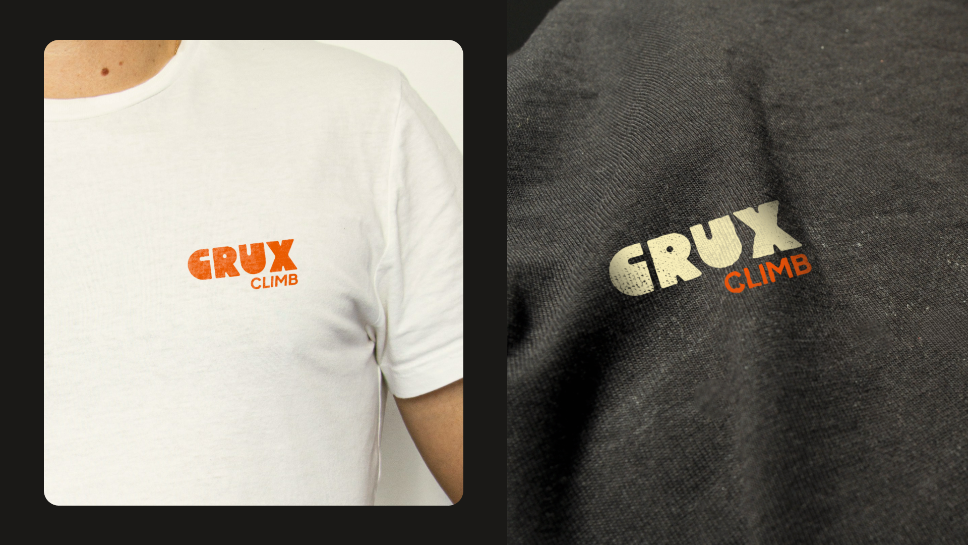
Crux Climb is a modern bouldering gym and community hub focused on movement, challenge, and connection. The brand identity was built around the concept of the "crux" - the most difficult point of a climb - symbolising focus, determination, and breakthrough moments.
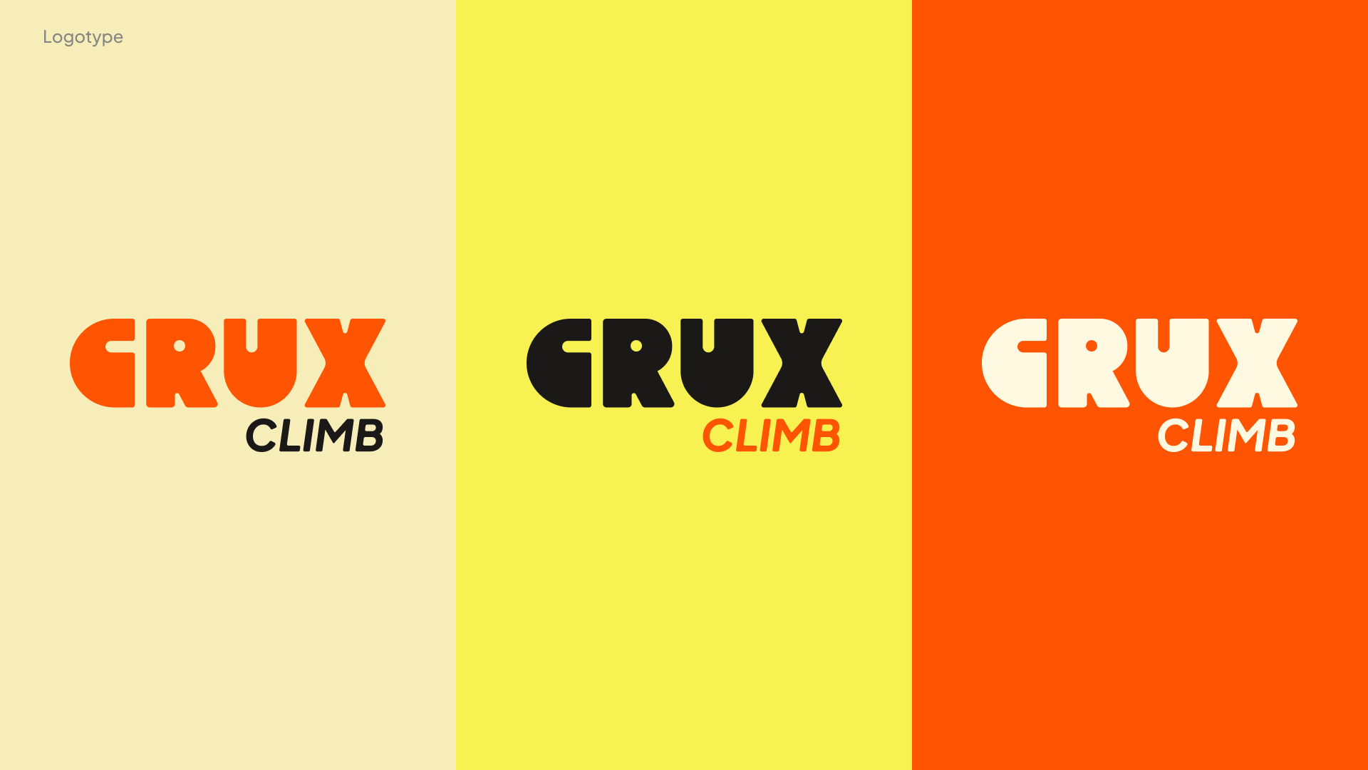
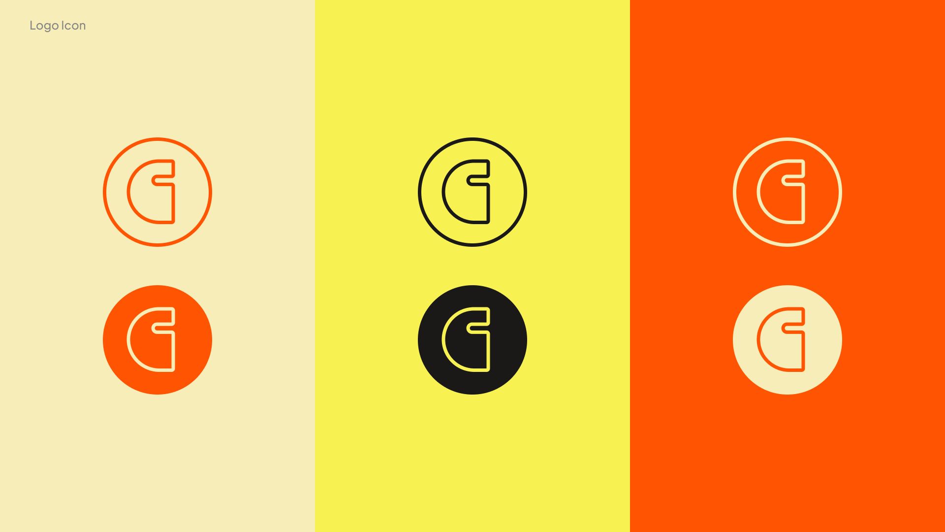
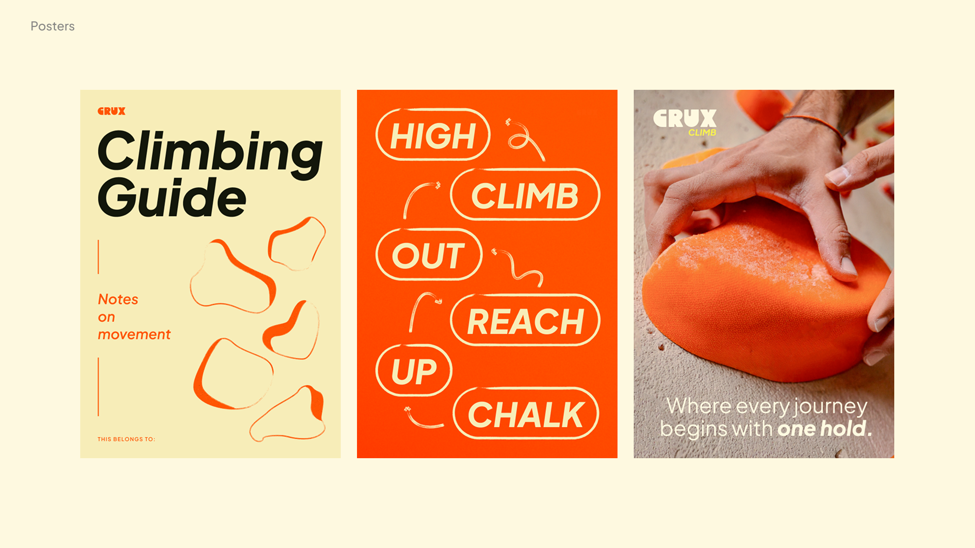
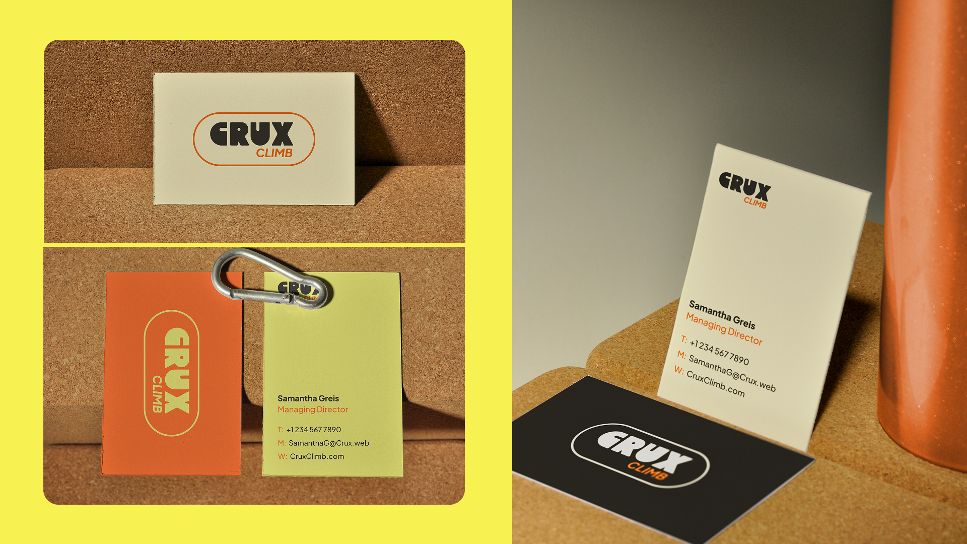
The colour palette features bright, bold yet earthy tones - with a distinct contrast between vibrant oranges and yellows and more grounded beige secondary colours. This combination evokes both energy and approachability, while tying the visual language to natural climbing environments.
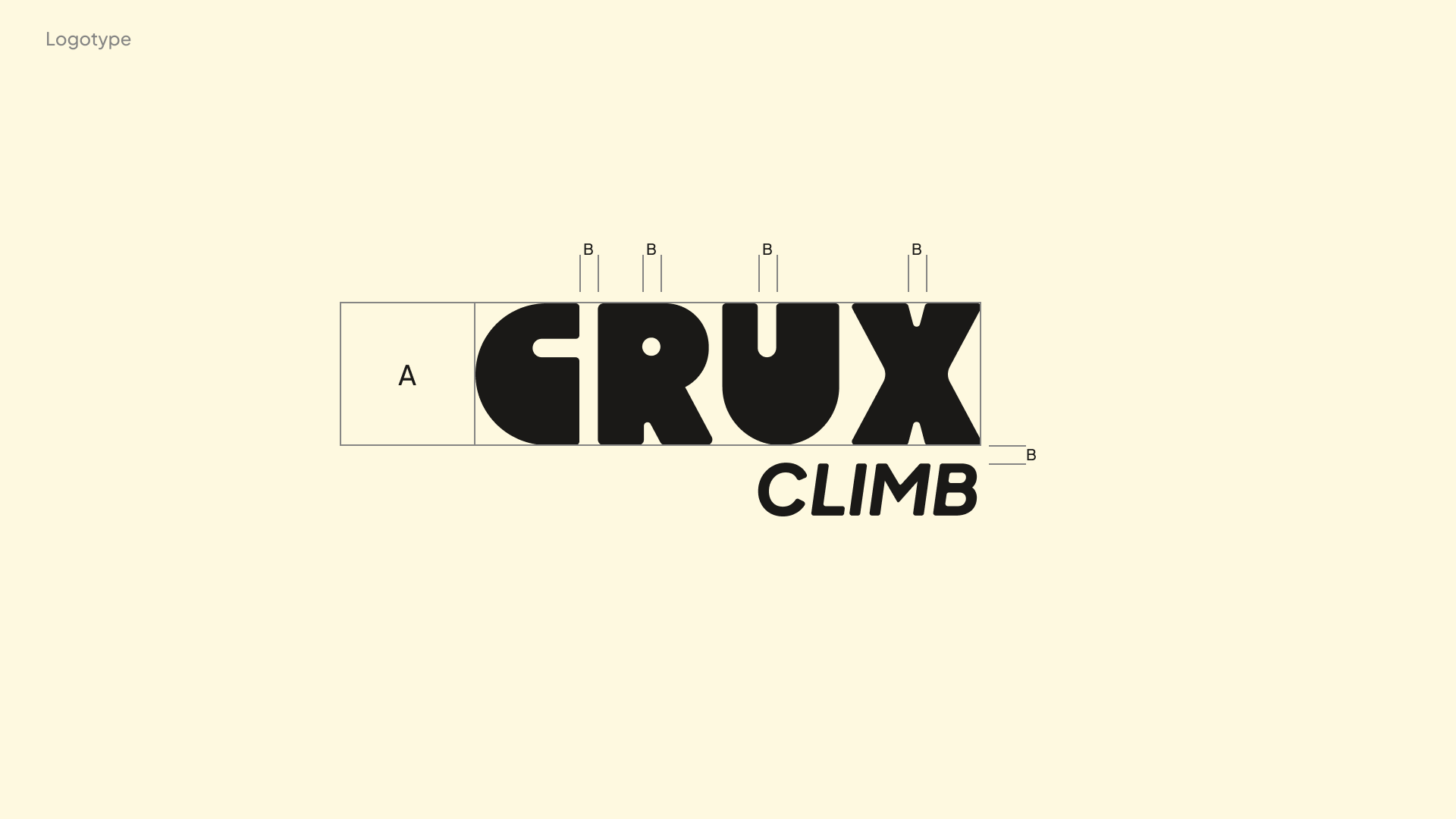
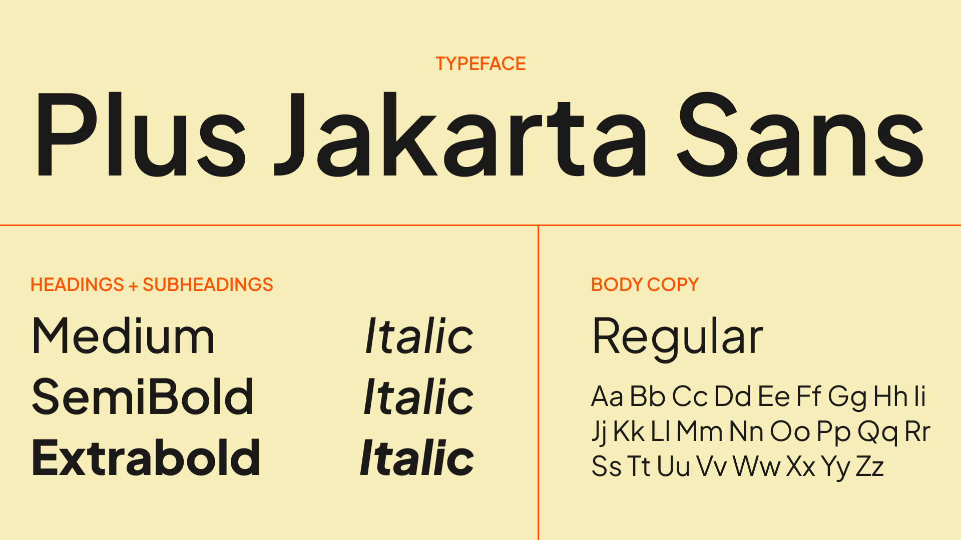
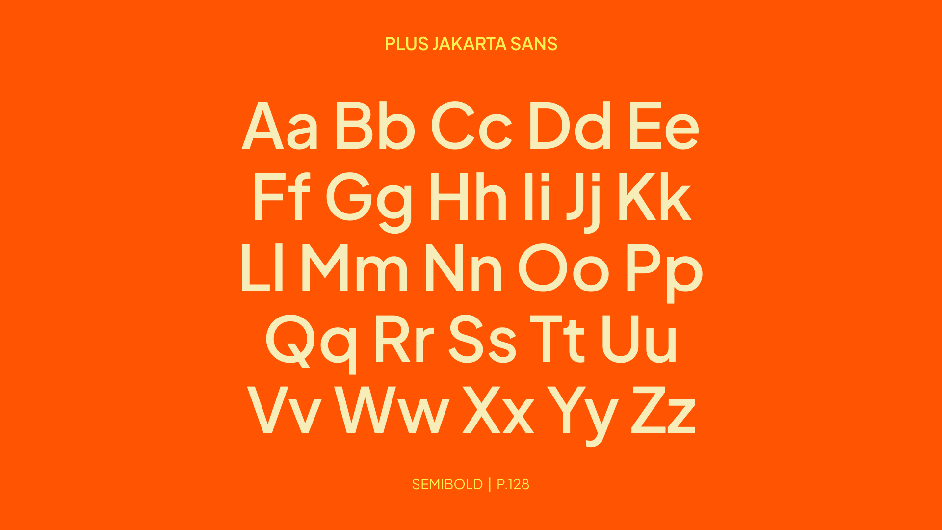
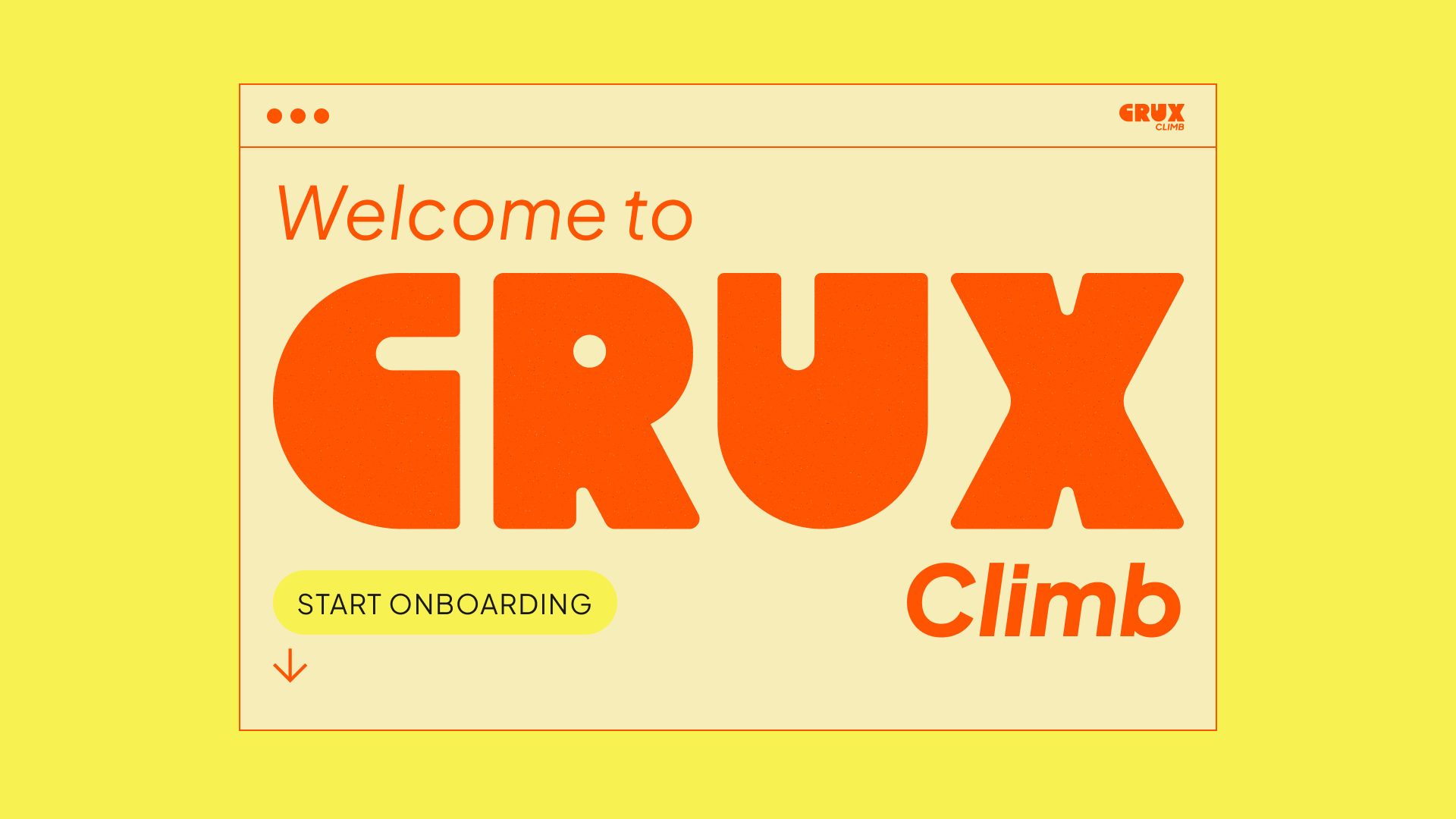
The logo features chunky, eye-catching letters - large and bold, yet approachable - as if drawn with a thick marker. This adds a sense of humility and a human touch, making the identity feel personal and down-to-earth. A clean sans-serif typeface paired with rugged, angular elements reflects the brand’s fusion of minimalism and grit.
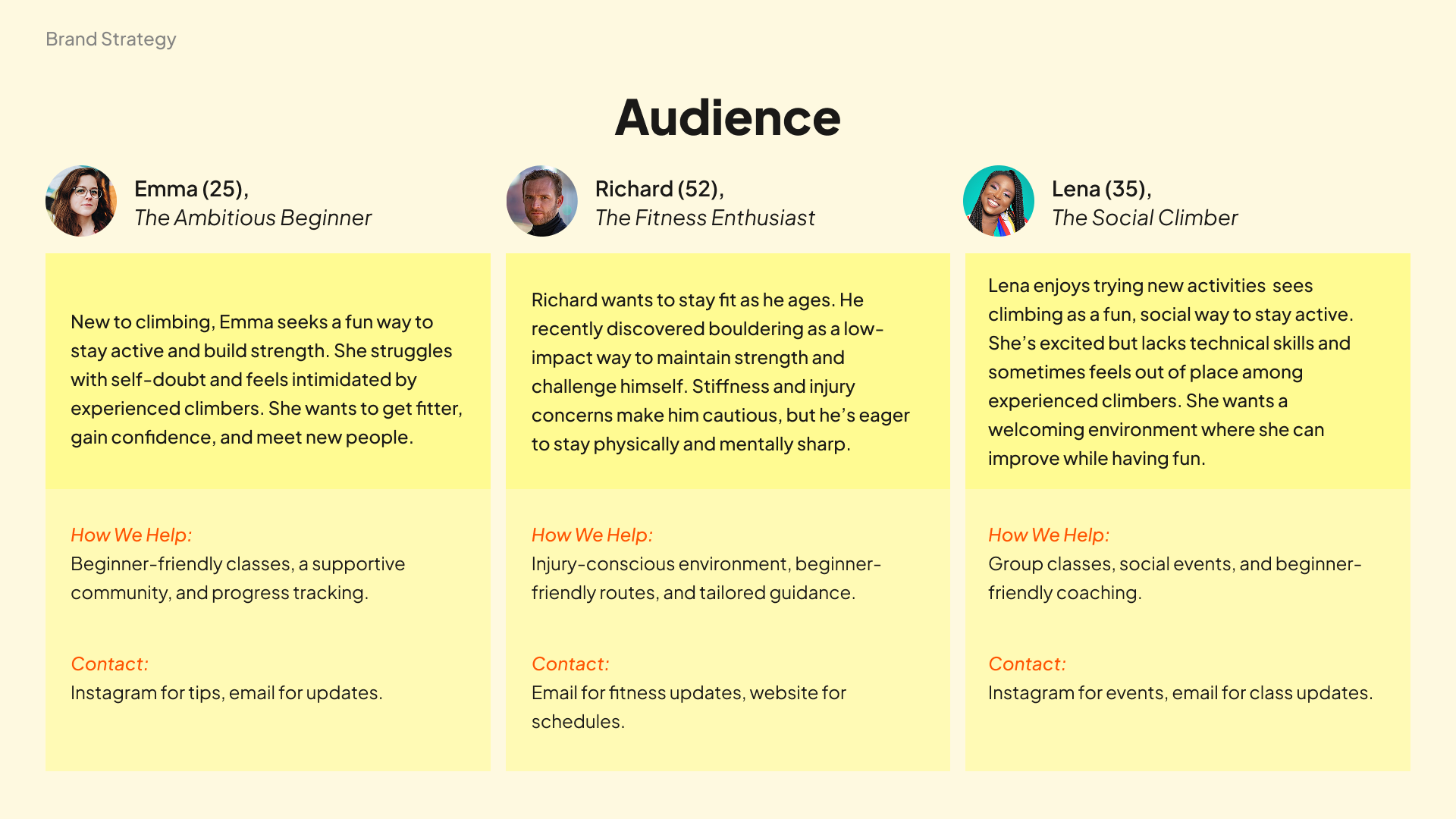
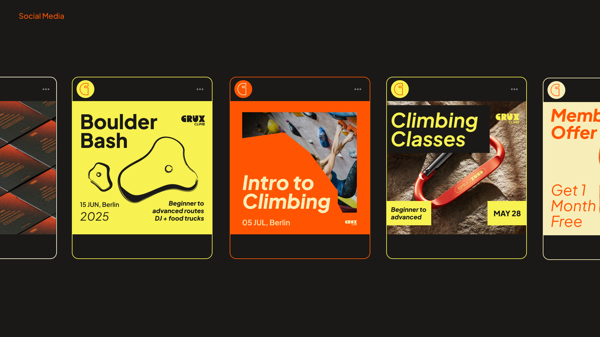
The identity system extended across core assets including logo, colour scheme, typography, signage, merchandise, and social media - all designed to communicate Crux Climb’s dynamic, welcoming, and community-driven spirit.
Sector
Fitness
Role
Creative Direction
Work
Visual Identity